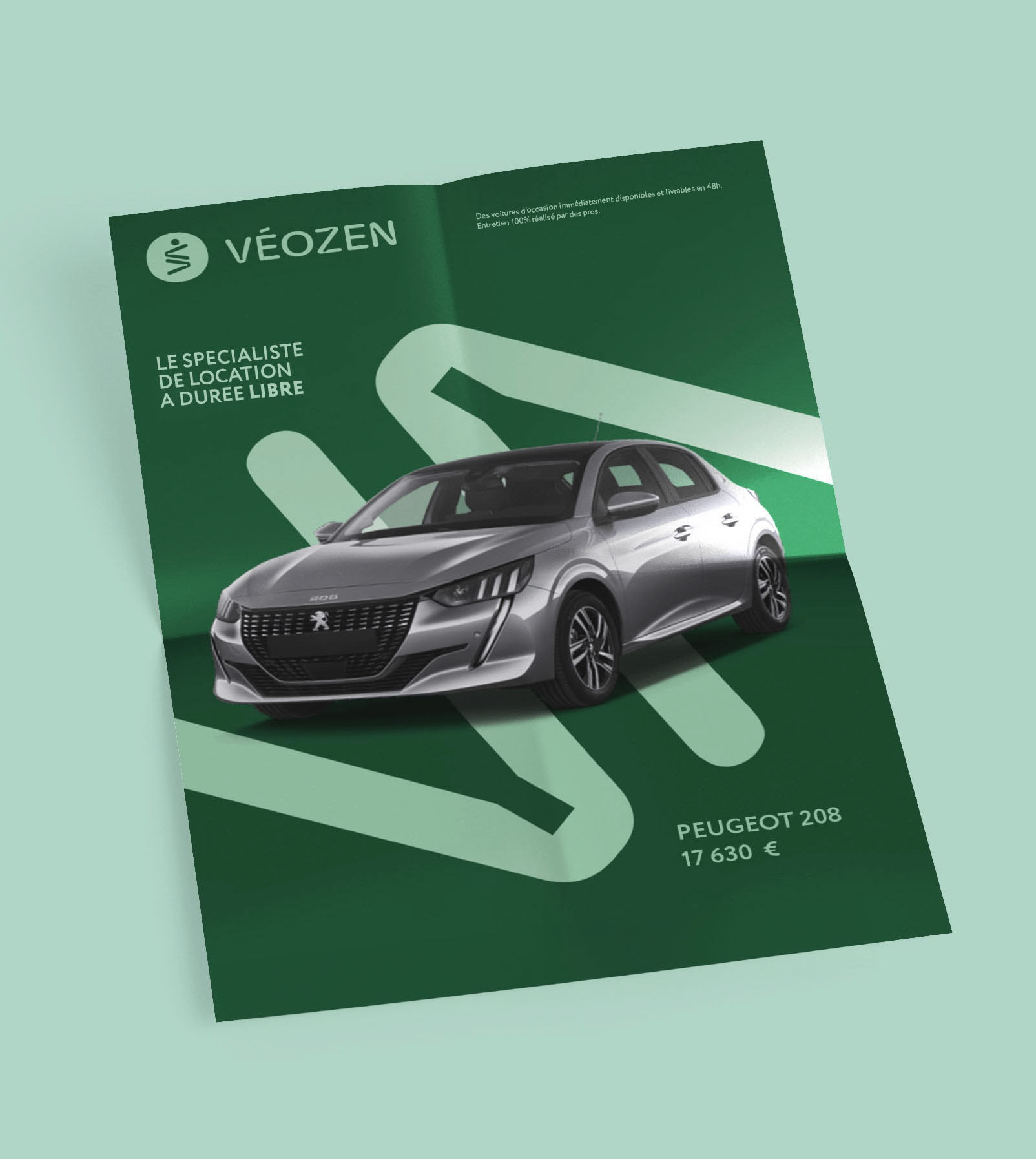
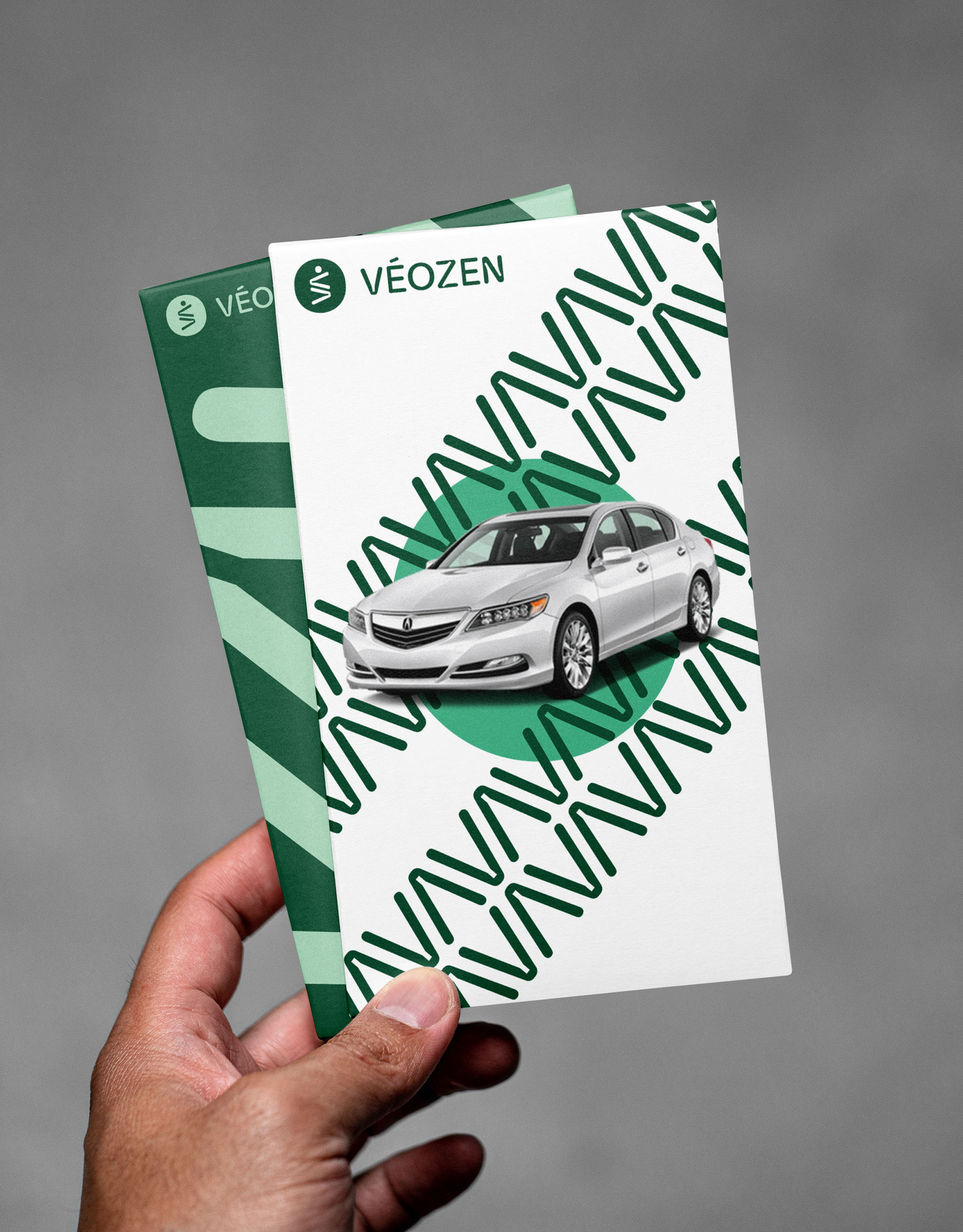
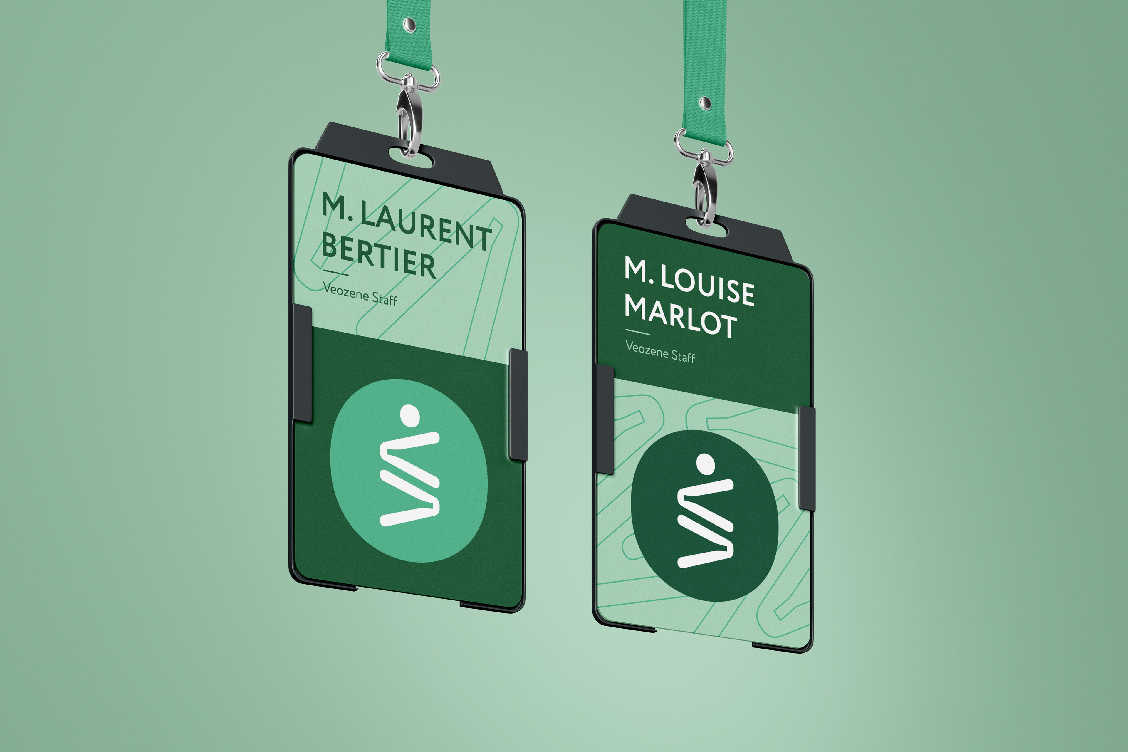
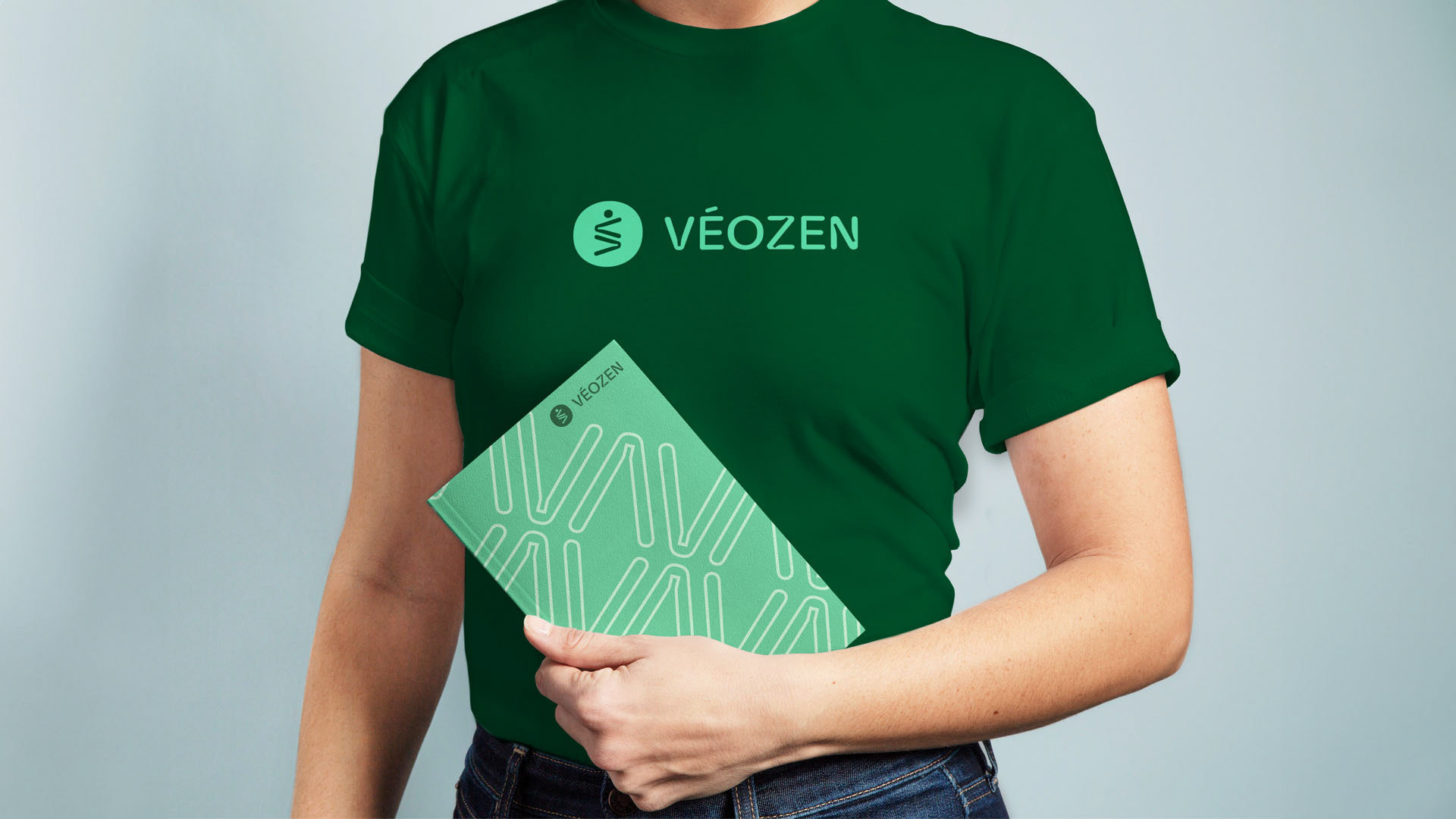
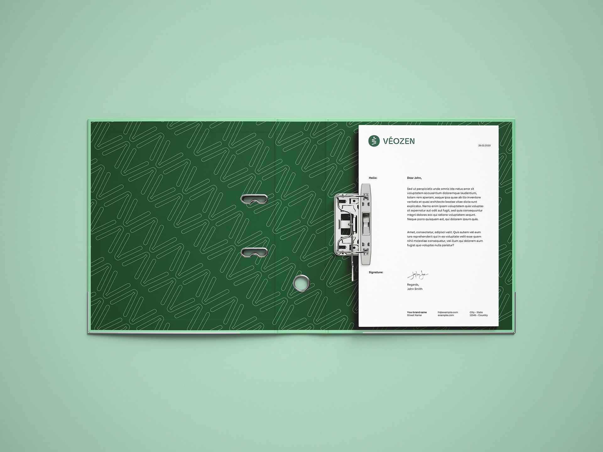
This branding and editorial project reimagines Veozen, a used car dealership, with a more human-centered visual identity. At the core of the redesign is the wheel trace/mark, symbolizing the journey each car has traveled and serves as the foundation for the custom typography and logo design.
